You can find the final code for this blog post on GitHub.
Our Goal
High Level Approach
The basic approach we’re going to take looks like this:
- Draw our starting Composable.
- Draw our ending Composable on top of our starting composable.
- Hide the ending Composable, using a Circular Clip. Clipping cuts off everything drawn outside of a particular shape.
- Animate the Clip’s size and position to achieve our desired reveal effect.
Defining Our Start and End States
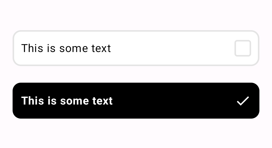
We’ve created a CheckItemContent Composable, that is able to draw our beginning and ending states.
The content of how we’re doing that is less important. You can see the Composable API below, as well
as start and end states:
// Start state
CheckItemContent(
    text = "This is some text",
    checked = false,
)

// End state
CheckItemContent(
    text = "This is some text",
    checked = true,
)
Creating the CircularRevealAnimation Layout
Let’s create the skeleton of our layout. Following the steps above, we’ll draw our startContent,
then our endContent on top. Then we animate a float value tracking what % of our endContent to
reveal, and clip the endContent in a circle based on that percent.
@Composable
fun CircularRevealAnimation(
   revealPercentTarget: Float,
   startContent: @Composable @UiComposable () -> Unit,
   endContent: @Composable @UiComposable () -> Unit,
   modifier: Modifier = Modifier,
   animationSpec: AnimationSpec<Float> = spring(),
) {
   // Tracks if the finger is up or down in real time
   var isFingerDown: Boolean by remember { mutableStateOf(false) }
   // Tracks the last position of the finger for the duration of the animation
   val fingerOffsetState: MutableState<Offset?> = remember { mutableStateOf(null) }
   // The percent of the top layer to clip
   val endContentClipPercent by animateFloatAsState(
      targetValue = revealPercentTarget,
      label = "Circular Reveal Clip Percent",
      animationSpec = animationSpec,
   )

   Box(
      modifier = modifier
         .pointerInput(onPointerEvent) {
            // TODO track finger events
         },
   ) {
      // Track
      if (endContentClipPercent < 1f) {
         startContent()
      }

      // Draw the top layer if it's not being fully clipped by the mask
      if (endContentClipPercent > 0f) {
         // TODO clip the top layer
         endContent()
      }
   }
}
Clipping the End Content
Let’s surround our endContent in a Box so that we can apply a Modifier to it that clips. We
only need to clip if the endContentClipPercent is less than 100%.
In order to clip, we’re going to use the drawWithContent modifier, which allows us to adjust the
Canvas of the child Composables. drawWithContent also gives us the size of the underlying
content, which we need for calculating our clip size.
val path: Path = remember { Path() }

val clipModifier: Modifier = if (endContentClipPercent < 1f && fingerOffset != null) {
   Modifier.drawWithContent {
      path.rewind()

      val largestDimension = max(size.width, size.height)

      path.addOval(
         Rect(
            center = fingerOffset,
            radius = endContentClipPercent * largestDimension
         )
      )

      clipPath(path) {
         // Draw the child Composable inside the Clip
         this@drawWithContent.drawContent()
      }
   }
} else {
   Modifier
}

Box(
   modifier = clipModifier
) {
   endContent()
}
Tracking the User’s Finger
We need to do some basic pointer tracking to keep the state of the users finger and its last known location:
modifier.pointerInput(onPointerEvent) {
    awaitPointerEventScope {
        while (true) {
            val event: PointerEvent = awaitPointerEvent()

            when (event.type) {
                PointerEventType.Press -> {
                    isFingerDown = true
                    val offset = event.changes.last().position
                    fingerOffsetState.value = offset
                }
                PointerEventType.Release -> {
                    if (isFingerDown) {
                        isFingerDown = false
                    }
                }
                PointerEventType.Move -> {
                    if (isFingerDown) {
                        val offset = event.changes.last().position
                        if (
                            offset.x < 0 ||
                            offset.y < 0 ||
                            offset.x > size.width ||
                            offset.y > size.height
                        ) {
                            isFingerDown = false
                        } else {
                            fingerOffsetState.value = offset
                        }
                    }
                }
                else -> Log.v(TAG, "Unexpected Event type ${event.type}")
            }

            onPointerEvent?.invoke(event, isFingerDown)
        }
    }
}
Putting It All Together in the CircularRevealCheckItem
Now we create a higher level Composable that uses the lower level CircularRevealAnimation to
create our new Composable:
@Composable
fun CircularRevealCheckItem(
    text: String,
    checked: Boolean,
    onCheckedChange: (checked: Boolean) -> Unit,
    modifier: Modifier = Modifier,
) {
    var isFingerDown: Boolean by remember { mutableStateOf(false) }

    CircularRevealAnimation(
        revealPercentTarget = if (isFingerDown) {
            0.12f
        } else {
            if (checked) 1f else 0f
        },
        startContent = {
            CheckItemContent(
                text = text,
                checked = false,
            )
        },
        endContent = {
            CheckItemContent(
                text = text,
                checked = true,
            )
        },
        modifier = modifier,
        onPointerEvent = { event, fingerDown ->
            when (event.type) {
                PointerEventType.Release -> {
                    if (isFingerDown) {
                        onCheckedChange(!checked)
                    }
                }
            }
            isFingerDown = fingerDown
        }
    )
}
End Result
You can find the final code for this blog post on GitHub.